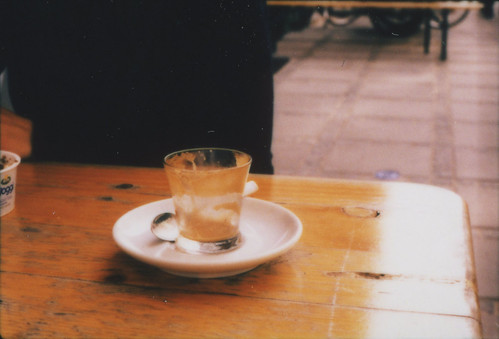
2. the kitten spent yo-yo

3. Phelm the dog is spent
IF: Spent
I am away for the weekend, but was able to use a scanner in the house I am staying it. It works well enough, but now I am confident that spending $$ on my scanner was worth it.
aggressive drawer
 I have been working on this concept for a really long time. I think this is the final rendition, but I am open to suggestions. The orange lines indicate different hemispheres and the green indicates the growing seasons of coffee in different countries.
 Klaus Thomsen
World Barista Champion, twice national champion and world-wide coffee consultant. Started as a barista in London in 2001.Peter Dupont
Internationally acclaimed roast master and green coffee buyer. MSc with thesis in water environment at coffee farms. Blended and roasted the WBC winning espresso blend for Klaus Thomsen. Started as a Barista in Bergen, Norway, 1998.Casper Engel Rasmussen
World Cup Tasting Champion. Coffee and sales representative for the last three years. Barista trainer and former member of the Danish national barista team. Barista since 2003.Linus Törsäter
Master in Architecture, SLU Alnarp Sverige. In charge of design and visual appearance. A very dedicated barista since 2004.


 As many people have already, astutely, pointed out this "new" logo looks like something from a tech company from the 90's. They went from something tall, thin, smooth, and the symbol of all things preppy to fat, bold, with a punch in the face of Helvetica to make it mundane. If the new logo were to have a conversation with the old logo it would go like this:


 What, are those Halloween cards?